Skills Used

-Sketch
-Idea Generation
-CSS
-HTML
-Wireframing
-Illustration
-Branding

Brief

We were given the task to design a set of 12 icons. It could be any topic of choice.

My aim was to be as creative as possible. I really wanted this project to challenge my imagination.

Process

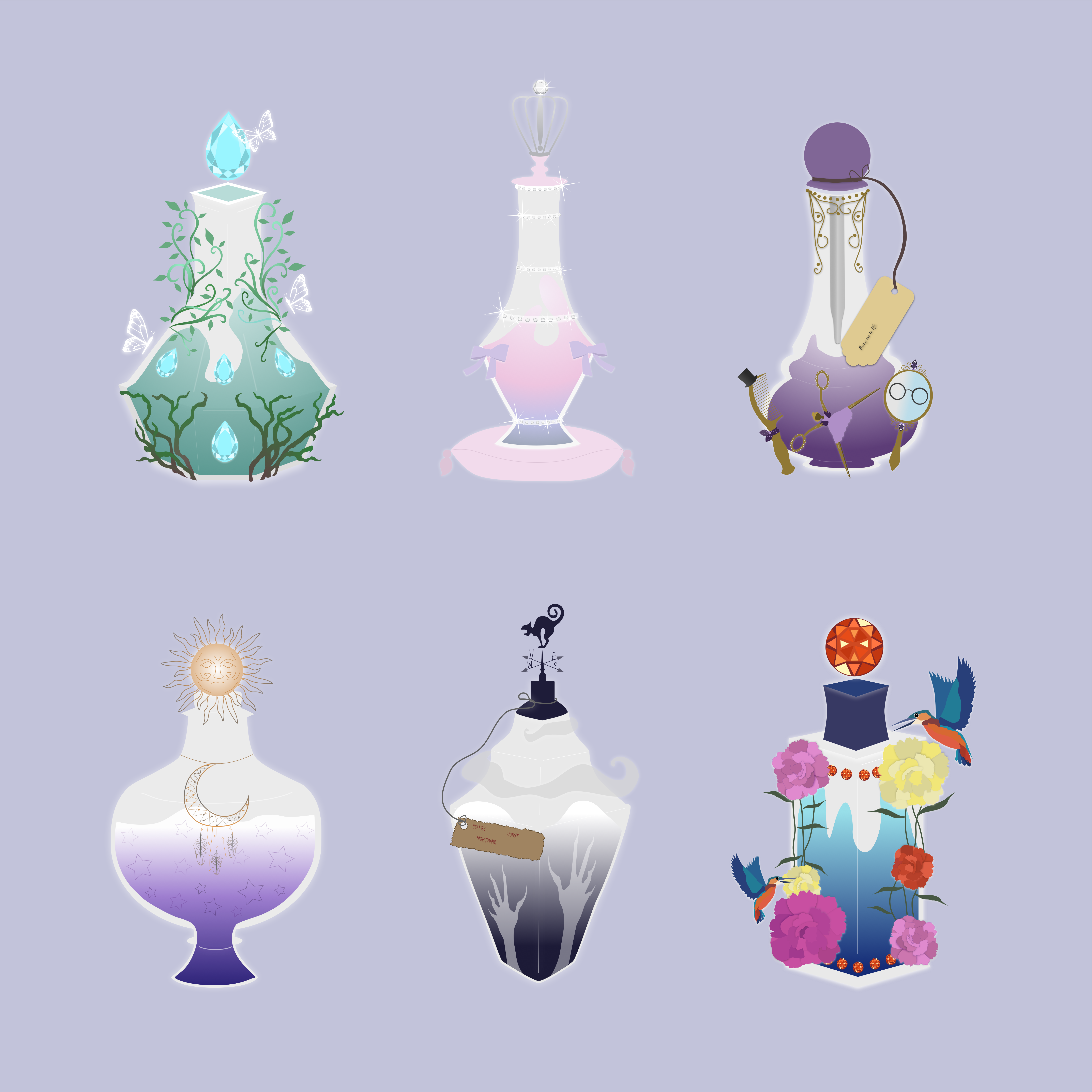
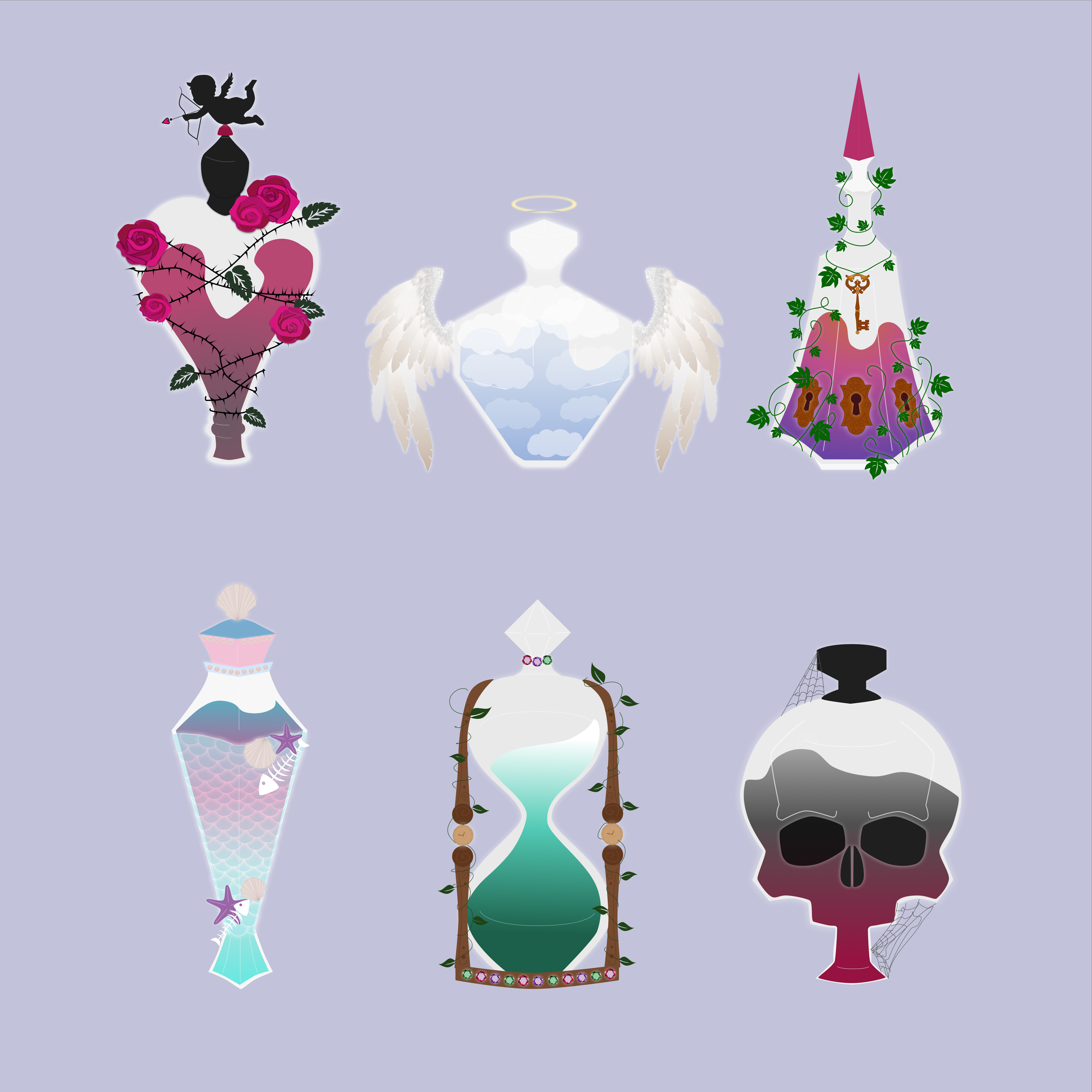
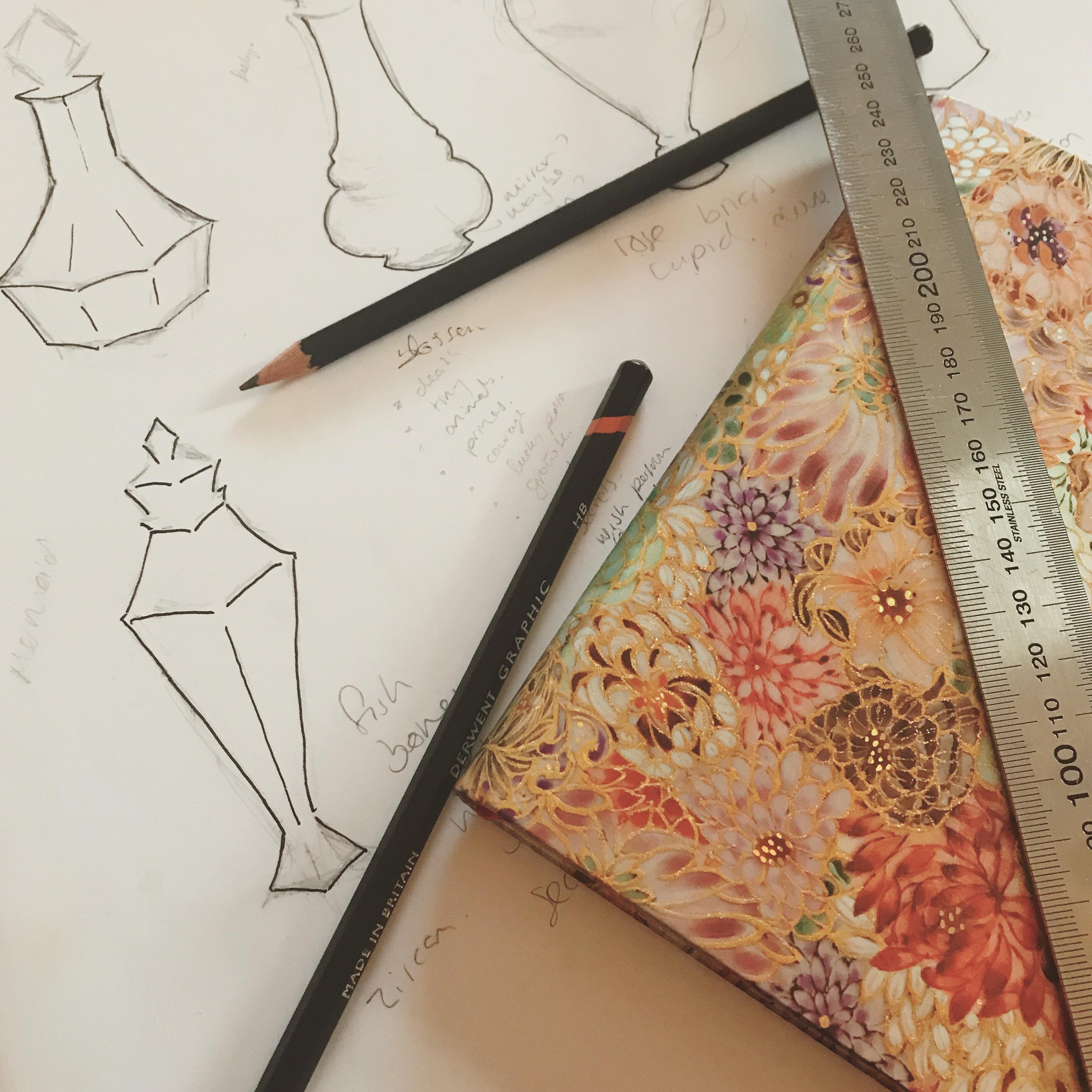
Firstly, I began to brainstorm my ideas. After multiple mind maps and sketches I had narrowed my ideas down to bottles. I thought it would be a challenge to try and illustrate glass so I wanted to work around this idea.

As I love detail I really wanted to focus my project on that. I began to think and sketch out different bottle shapes taking inspiration from perfume bottles. The more I sketched, the more I thought about the idea of potion bottles. This seemed perfect as I could be as creative as I wanted with my designs.

Icons

The icon creation began. I was really excited about this project as I could be as imaginative as I wanted to be. I decided to come up with all the potion types first which was really fun. I then based the designs of the bottles off the purpose of the potions.

The shape of each potion bottle is meant to reflect the potion itself. Whether it is tall or small, or has softer or harder edges, I tried to mirror the intent of the spell.

The images on the bottles, either directly symbolise the potions themselves, or are inspired by the theme.

Site

Lastly, I created a site to showcase my finished designs. I decided to stick to a very simple layout as I wanted to make sure the focus would be on the illustrations.

The content on the website simply explains the effect of the potion. It gives a list of the different ingredients contained.

I also included buttons to download the icons.

You can view it here ♥